
Friday, 14 August 2009


IDEAS-new layer


the print didn't really work with the embossed logo, so i decided to design another layer which will be printed over the gradient layer. to put more anthesis on the logo. this would also make the print look more aphetically pleasing. here are some quick ideas which i have drawn on some of the test prints.
Embossed print


the embossing was not as successful as i had expected it to be, as it was too subtle and could only be noticed when looked at closely.
Embossing Template


i then decided to make an embossing template for the logo so that it would be a nice way to subtle include it on the print.
Colour Gradient

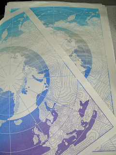
i decided to use a gradient for these screen prints as it would work well with the northern lights skys which are at the North Pole.
i used printed 10 prints with a purple/blue/silver/sky blue gradient
and 10 prints with a magenta/purple/blue/silver/sky blue and green gradient.


Template-screen

i designed my template for the print in a way so the colour would invert when it entered the arctic circle. i decided to use a style of illustration which would work well for a map so i used contoured line work on the main part of the map.

i also added another grid on top of the map part so that it would look more like a map. the template was then simplified so that it would work as a one colour screen.
NEW screen print idea


Above i have created some variations for a logo which reads ARCTIC CIRCLE. i have decided to do a print based on this logo, because it is pretty hard to figure out it reads arctic circle unless you have been told. If you want proof draw it out and ask someone what they this is says and watch them struggle.
I decided it would be interesting to see how this logo would combine with a map of the North Pole.
Thursday, 6 August 2009
NEW character ideas


Here are some characters ideas which i have based around mobile phones. The inspiration for these characters came from my phone which is an ancient sony samsung d9 whatever. i have based them around slide phones, the idea for the characters is that when the phone is normal the face looks unhappy and when it slides open the face looks happy. i will refine these images by using illustrator and photoshop and use them for briefs for Carphone warehouse for example. As they have offers where you can trade old phones for new ones or cash.
Subscribe to:
Posts (Atom)